
Designing for emergency response
A company that creates IoT sensors to track human vitals like heart rate, temperature, sleep, etc. discovered that their devices, which has the ability to detect emergencies and possibly save lives, were failing to do so. Their software solution was at fault.
Team
-
1 Project Manager
-
1 Technical Architect
-
1 UX Designer (Me)
My Responsibilities
-
Lead the discovery phase
-
Assist user research
-
Create IA & user flows
-
Customer journey mapping
-
Create wireframes
Project Duration
-
6 weeks
Our team was tasked with identifying what caused the gap between nurses' and residents' vitals. We investigated use cases, scenarios, and the very busy schedule of nurses.
The sensor devices are used in elderly care facilities where nurses monitor residents round the clock.
We spent five weeks conducting multiple rounds of user research, mapping information architecture, sketching wireframes, and user testing.
Our final deliverable was a fully interactive medium-fidelity wireframe created in Axure RP.
Turning multiple documents into bite-sized insights.
A massive PRD (Project Requirement Document) was shared to us which detailed what is currently in place, what their business goals are moving forward, and the effect they hope to achieve.
Here’s what they had:
-
A web app was already in place to receive notifications from sensors but the nurses weren’t using it. A mobile app was also in place to receive alerts, but nurses found it more inconvenient than useful.
-
They want to help nurses save time by presenting information in a way that is usable and suggest possible health threats before it happened.
-
Upgrade their hardware based on any of the issues & solutions we identify during user research.
-
Improve communication between nurses and family members of the elderly residents.
This project was exciting from the get-go. Tackling real problems for real users.
Who are we designing for?
Nurses.
The catch: They don’t speak English. We’re designing an app in CJK (Chinese, Japanese, and Korean).
All our research questions were created in English, translated to CJK, and shared with the client. The actual interview was done by the client, results translated to English and shared back to us. Yes, there was a lot of back and forth but it was so exciting that we were more than happy to do it.
The client recruited 6 willing nurses for short Zoom calls to get our questions answered.
The assumptions we were testing through user research:
1. The web app was not used because the elderly care centre had only one computer on each floor, and the nurses were too busy attending to residents. The computer is checked only when nurses visit the station for medicines or refills.
2. The mobile app receives calls from the elderly, but it is ineffective as all caregivers share the same app account and have common company-sponsored mobiles.
3. Features like viewing 24-hour graphs of the vitals will be useful as residents can share it with doctors during checkups.
The user interview results:
1. Nurses are super busy. They have no time for web apps. They are constantly working and interacting with the elderly. The only time they use the web app is at night to see if all patients are asleep or not. If they are awake, nurses go to their rooms for checkups.
2. The call feature is rarely used. The elderly residents are very old and most of them cannot hear well. Having common mobile phones is not an issue at all.
3. The nurses love the current mobile app but it does not have many important features. When an alert is received on phone, no detail is shown. They must run to the nurse’s station to check the web app and see what the alert was about.
This was all well-documented but it is very hard to relate to a text document. We wanted everyone to be on the same page so we went ahead to make a persona.
Our persona - The nurse

So, how might we...?
How might we help nurses assist elders promptly?
How might we stay out of their way at all other times?
Sketching a user flow to map an intuitive, obstacle free path
We started with the happy path and then looked at all possible edge cases. After multiple iterations here’s the user flow that impressed the team and stakeholders.

Moving from flow to form.
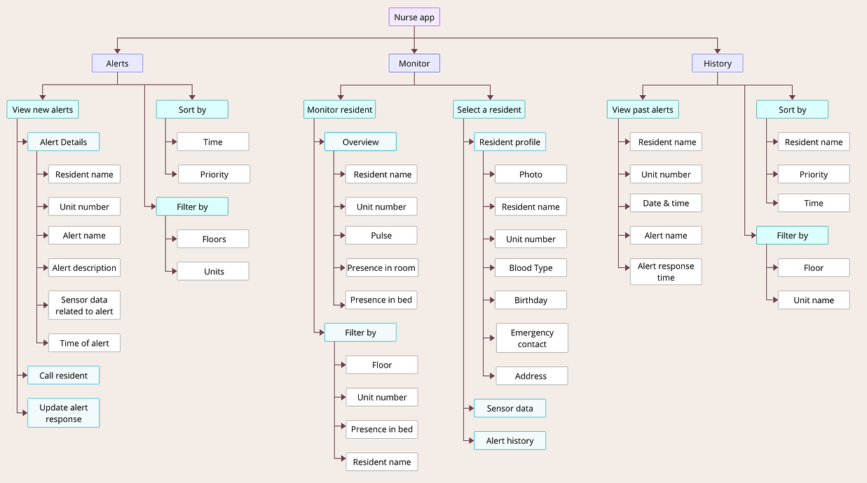
With that settled, we divided the app into its three main sections based on the userflow.
1. Alerts: The latest alerts are displayed along with the relevant sensor data and a short description of what is happening.
2. Monitor: Search or Filter through all elderly members to check their vitals, whether they are awake/asleep, and what their 24-hour data looked like.
3. History: A list of all the previous alerts to come back for reference or updates.
Building a solid structure with IA
An information architecture is a diagrammatic representation of what information (or data) is accessible from where. Two important parts covered in an IA - navigation and data arrangement.
Time is scarce in our user's world. We were well aware of the fact that nurses will most likely just take a quick look and leave the app. Therefore it was extremely important to get the labels and content hierarchy right.
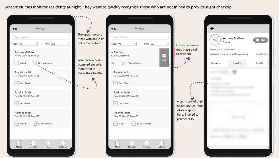
Show me some screens
It was time to bring out the drawing tools. I created medium-fidelity wireframes using Axure RP.
The screenshots you see below are the polished version created after many internal iterations.

We took everything we created, back to the user
Our users are extremely strapped for time (did I say that already?) but fortunately, our app is also a simple one. So we gave just two tasks in a remote usability test to 6 participants.
1. Let’s say you are at the end of your night shift and you opened this app to do the final night check of residents. Using this interface can you tell us who all are in/out of bed?
The insight: All participants were able to quickly and accurately understand the information, however, we discovered that there is an additional check they do at night. It is the presence/absence of residents in the room. So, if a resident is absent in bed, they check whether they are in the room or not.
2. You are at the nursing station and hear the alert tone, what would you do?
The insight: “Swipe” gesture for actions was not intuitive for participants. Even when swipe was specified as a possible action (as it will be shown during onboarding), 90% of participants still felt that it is “faster” to tap than swipe.
Bonus insight: Currently when a mild medical emergency occurs, the nurses take care of residents first and then message the family of residents via Whatsapp/Line. In the case of major medical issues, they inform family via call.
The downside they face in using Whatsapp/Line is that not all nurses have the family contact numbers. Emergencies may occur during anyone's duty time. So having the option to contact family within the app is a nice to have.
With all this new information we went back to the drawing board, moved things around, brainstormed, updated the architecture and reflected them on the wireframes.
The final look

When most apps are about capturing user attention and providing value, apps in the medical field are about how far away we can keep our users from us. Every single second is too precious and we simply cannot afford to take it away from their work.
My teammates went on to build the back-end technical architecture for the app. The visual design would be created by CJK native designers taking into consideration their trends and language constraints.
Unfortunately, the app was not developed by the company as they had a change of vision and proceeded to invest more in hardware sensors and then come back to software. Yes it was tough news to digest but we got some good reviews for our final round of user testing.
Reviews from final user testing
This alert system is so much better now! Before, we had to run to a desktop when an alert sound was heard. It was so stressful. We never know if it’s just a warning or an emergency.
We will save so much time with this app. Whenever companies approach us with new apps we are always hesitant at first because we are so busy and we don’t have time to sit and use their apps. But this one will actually help us.
My takeaway
My biggest takeaway from doing this quick project was that design is truly iterative. Sometimes we get stuck trying to find the *perfect* positions or the *perfect* words but the truth is, only the users know what’s working and what isn’t.
When it doubt, get data, iterate.